Bar Chart in Python — Matplotlib Examples & Best Practices
Learn how to create clear, publication-ready bar charts in Python using Matplotlib, pandas and Seaborn. Includes examples for vertical, horizontal, grouped and stacked bars, CSV input, labeling, and best practices for layout and annotations.
What is a Bar Chart?
A bar chart (or bar graph) is a visual way to compare values across different categories using rectangular bars. The length or height of each bar represents the value of that category.
📊 Example:
- Categories → Products
- Values → Sales numbers
Why Do We Use Bar Charts?
Bar charts are used because they are:
- Easy to understand – even for beginners
- Great for comparison – quickly compare categories
- Clear and visual – patterns stand out immediately
- Common in business & data analysis – sales, revenue, counts, survey results
When Should You Use a Bar Chart?
Use a bar chart when:
- You are comparing categories
- Data is discrete (not continuous)
- You want to show differences clearly
Examples:
- Sales by product
- Students per class
- Population by country
- Marks scored by students
Bar Chart Example
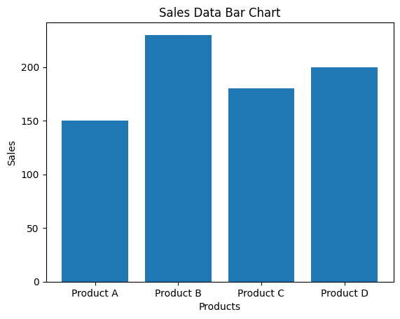
Here’s a simple bar chart in Python using sales data
Example explanation
- X-axis: Products
- Y-axis: Sales values
- We use matplotlib, which is the standard plotting library in Python.
Code used
import matplotlib.pyplot as plt

# Sample sales data
products = ['Product A', 'Product B', 'Product C', 'Product D']
sales = [150, 230, 180, 200]

# Create bar chart
plt.figure()
plt.bar(products, sales)
plt.xlabel('Products')
plt.ylabel('Sales')
plt.title('Sales Data Bar Chart')

plt.show()
Bar Chart Example for Beginners in Python
Example 1: Sales by Product
import matplotlib.pyplot as plt

products = ['Pen', 'Pencil', 'Eraser', 'Notebook']
sales = [120, 90, 60, 150]

plt.bar(products, sales)
plt.xlabel('Products')
plt.ylabel('Sales')
plt.title('Sales by Product')

plt.show()
🧠 What’s happening?
products→ categories (X-axis)sales→ values (Y-axis)plt.bar()→ creates the bar chart
Example 2: Students in Each Class
import matplotlib.pyplot as plt

classes = ['Class A', 'Class B', 'Class C']
students = [30, 45, 25]

plt.bar(classes, students)
plt.xlabel('Classes')
plt.ylabel('Number of Students')
plt.title('Students per Class')

plt.show()
Example 3: Horizontal Bar Chart
import matplotlib.pyplot as plt

countries = ['USA', 'India', 'UK', 'Canada']
population = [331, 1380, 67, 38]  # in millions

plt.barh(countries, population)
plt.xlabel('Population (millions)')
plt.title('Population by Country')

plt.show()
Example 4: Total Bill by Day — shows the total restaurant bill amount for each day using the online Tips dataset
https://raw.githubusercontent.com/mwaskom/seaborn-data/master/tips.csv
This dataset contains restaurant bill data.
Step 1: Read Online CSV in Python
import pandas as pd
import matplotlib.pyplot as plt

# Load CSV directly from the internet
url = "https://raw.githubusercontent.com/mwaskom/seaborn-data/master/tips.csv"
df = pd.read_csv(url)

# View first few rows
print(df.head())
Step 2: Prepare Data for Bar Chart
We’ll create a bar chart of total bill by day.
# Group data
bill_by_day = df.groupby('day')['total_bill'].sum()
It calculates the total bill amount for each day (Thur, Fri, Sat, Sun).
Step 3: Create Bar Chart
plt.bar(bill_by_day.index, bill_by_day.values)
plt.xlabel('Day')
plt.ylabel('Total Bill')
plt.title('Total Restaurant Bill by Day')

plt.show()
How to Read This Bar Chart
- X-axis: Days (Thur, Fri, Sat, Sun)
- Y-axis: Total bill amount
- Taller bar = higher total sales on that day
Example 5: Create a Bar Chart from API Data
What is API Data?
An API (Application Programming Interface) provides data directly from a server in formats like JSON.
Examples of API data:
- Weather data
- COVID-19 statistics
- Cryptocurrency prices
- Country population data
Steps to Create a Bar Chart from API Data
Step 1: Import Required Libraries
import requests
import matplotlib.pyplot as plt
Step 2: Get Data from an API
Example: Public API for country population
url = "https://restcountries.com/v3.1/all?fields=name,population"
response = requests.get(url)
data = response.json()
requests.get()→ fetches data from API.json()→ converts API response to Python data
Step 3: Extract Required Data
We extract country name and population.
countries = []
population = []

for country in data:
    countries.append(country['name']['common'])
    population.append(country['population'])
Step 4: Top 5 Countries by Population
# Combine countries and populations into a list of tuples
country_population_tuples = list(zip(countries, population))

# Sort the list by population in descending order
country_population_tuples.sort(key=lambda x: x[1], reverse=True)

# Extract the top 5 sorted countries and populations
top_5_countries = [country for country, pop in country_population_tuples[:5]]
top_5_population = [pop for country, pop in country_population_tuples[:5]]

print("Top 5 Countries by Population:")
for i in range(5):
    print(f"{top_5_countries[i]}: {top_5_population[i]}")
Step 5: Create Bar Chart
plt.bar(top_5_countries, top_5_population)
plt.xlabel("Country")
plt.ylabel("Population")
plt.title("Top 5 Countries by Population")
plt.xticks(rotation=45, ha='right')
plt.tight_layout()
plt.show()
Example Output (Explanation)
- X-axis: Country names
- Y-axis: Population
- Each bar represents population of one country
This program fetches data from an API, extracts required fields, and displays them using a bar chart.
Simple Diagram of Flow
API → JSON Data → Python Lists → Bar Chart
Why Use API Data?
✔ Real-time data ✔ No manual CSV download ✔ Used in dashboards & analytics ✔ Common in real-world applications
Summary
| Term | Meaning |
|---|---|
| Bar Chart | Compares categories using bars |
| X-axis | Categories |
| Y-axis | Values |
| plt.bar() | Vertical bar chart |
| plt.barh() | Horizontal bar chart |
📘 Related Topics
- 100 Ways to Visualize Data Using Python — Complete Guide
- Pie Chart in Python — Matplotlib Examples & Best Practices